Note: This is a (late) April fool’s post. It’s not to be taken seriously.
Hi,
So I’m a member of freenode‘s volunteer staff. I mostly deal with user support tasks and development, but I sometimes volunteer on other tasks as well. In this case, I took on the task of helping write our April fool’s blog post. I created the image that you see in the blog post.
I will now teach you how to create an image so horrible it can be used in freenode’s April fools blog post, too!
Open GIMP and create a 2648 x 852 image. The hugeness of it contributes to it looking like a scanned newspaper release.
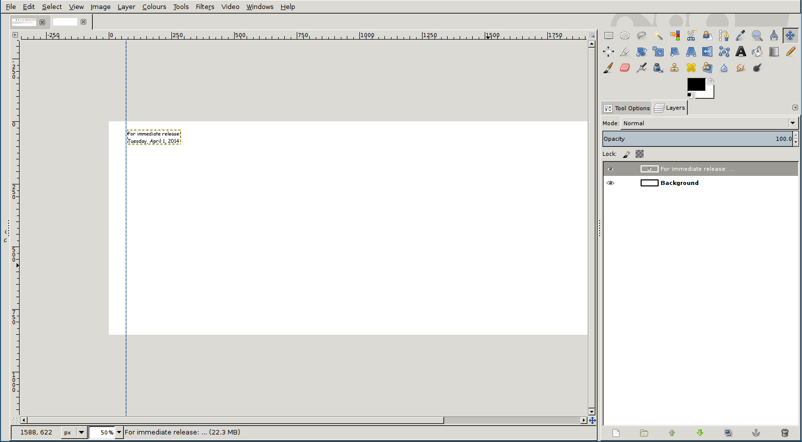
We will start with the easy elements. Grab the text tool and type ‘For immediate release: Tuesday, April 1, 2014’ in 20pt Comic Sans MS. put the text on the top left of the image, with some margin. Then, drag a guide from the left ruler to where the text is, so that the rest of our elements will be aligned well.
You should now get something like this:
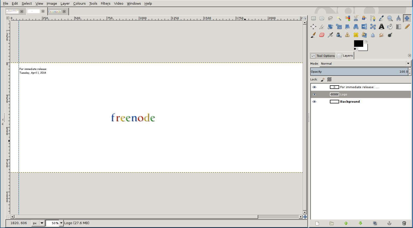
Next, create the freenode logo in Google font. Luckily, there are web tools that do this; we will be using http://myog.searchmyway.com/?name=freenode
Take a screenshot of that logo, and open the screenshot in GIMP. If necessary, crop the logo to size so it has no extra white space; you can do this with Image -> Autocrop image. Now, copy your logo and go back to your original image. Make sure you have the ‘layers’ panel up; if not it’s in Window -> Dockable Dialogues -> Layers, or ctrl + L. On that window, the bottom left button creates a new layer. Click on it, then paste your logo. Then go go layer -> Anchor Layer, or press ctrl + H. If you did this right, you should have your logo in its own layer. You can give it a name, such as ‘logo’ to make things easier. Also, go to layer -> autocrop layer so that the layer is the right size.
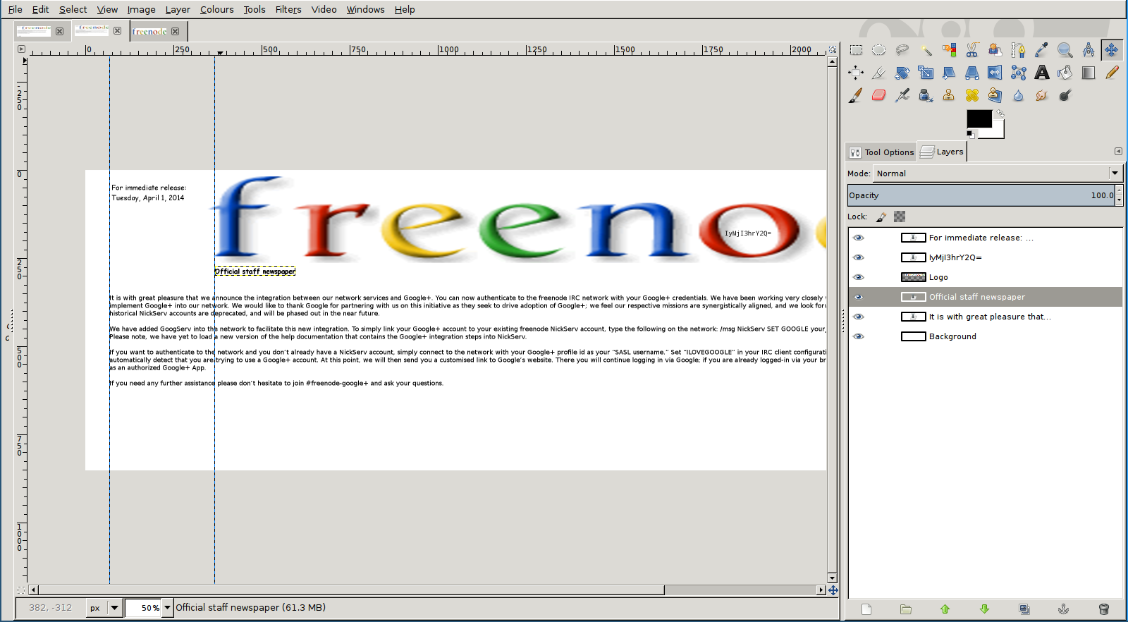
You should have something like this at this point.
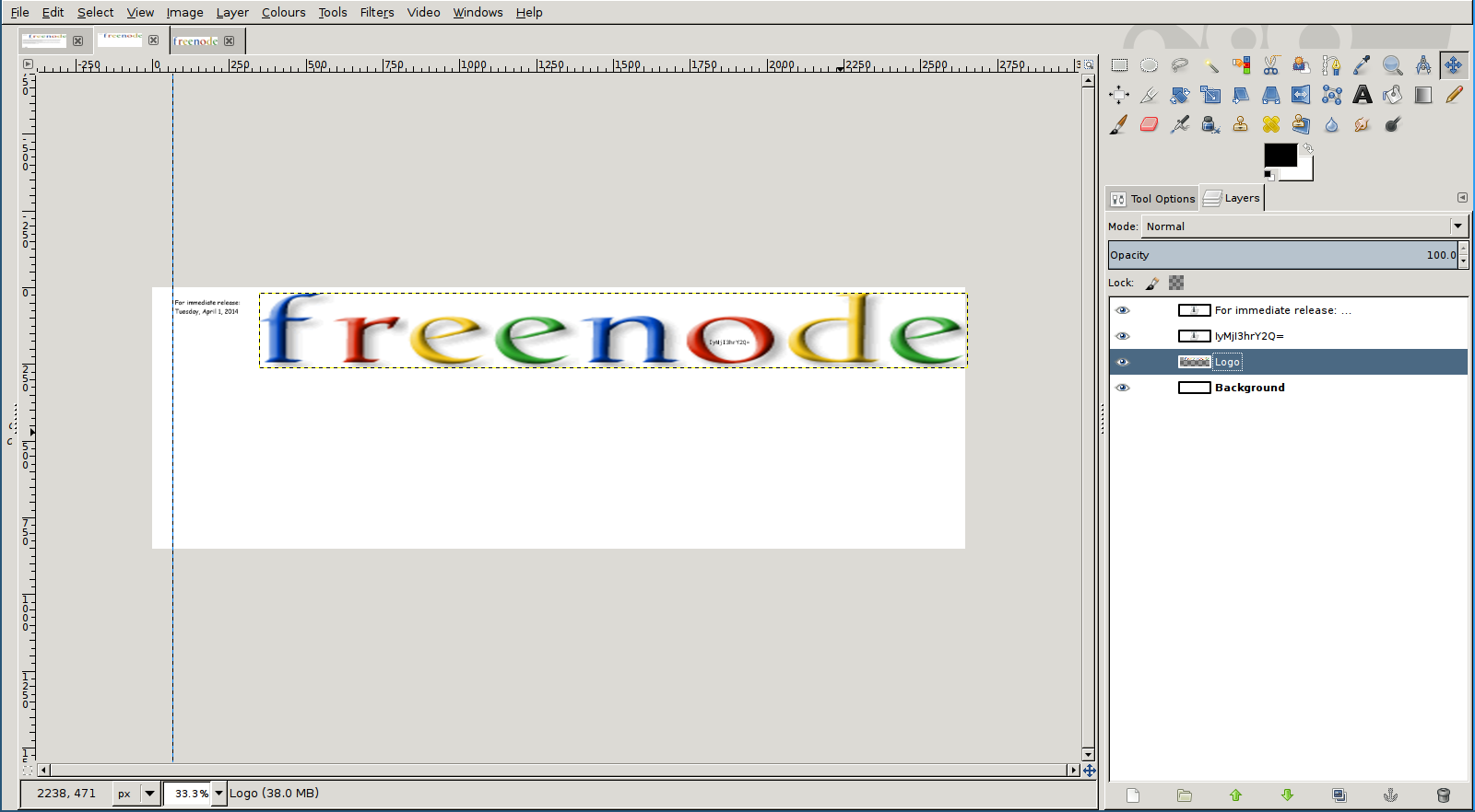
Now here’s the tricky part: we want to insert our crypto’s challenge first clue, ‘IyMjI3hrY2Q=’ into the ‘o’ in ‘freenode’. To do that, we need to stretch our logo out enough. First, use the text tool to actually write ‘IyMjI3hrY2Q=’ in monospace font and size 18. Place it anywhere for now. Now, drag your logo layer near the date, with some margin, and start scaling it proportionately (select the scale tool, and make sure the little chain icon is pressed) until it fills the whole image width. After that, select the scale tool again, but this time make sure the icon is not active (so press it again). Finally, reduce the layer height until it’s around 240 pixels. It’s okay if it’s slightly more or slightly less.
You can now drag your text layer (the IyMjI3hrY2Q= one) to be inside of the ‘o’.
At this point, you should have something like this:
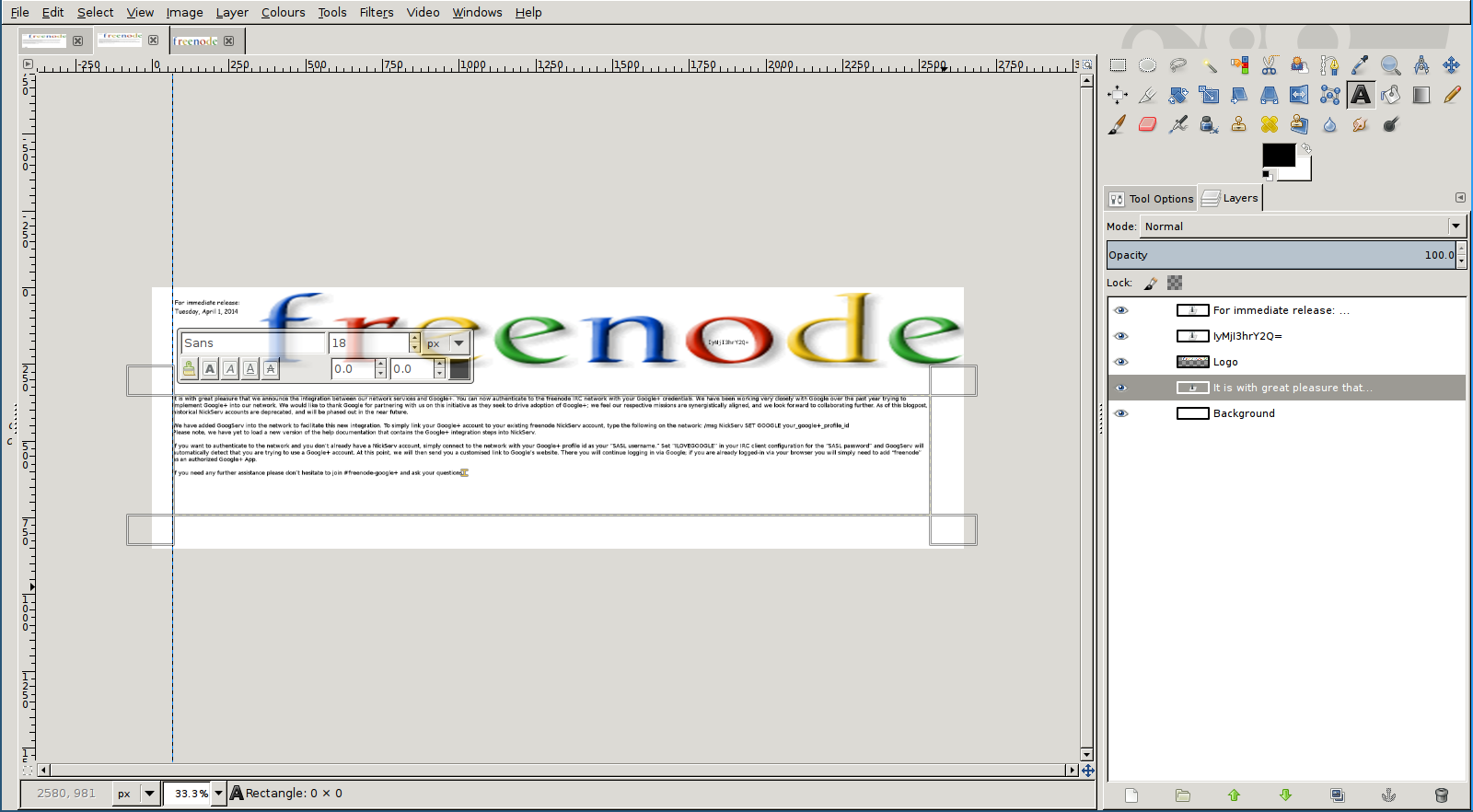
Now the hard part is done. For the next step, we will add the main text. Select the text tool, and click on near your guide (and with some margin under the logo) and start dragging the text tool until it takes almost full width. Copy and paste the following text:
It is with great pleasure that we announce the integration between our network services and Google+. We have been working very closely with Google over the past year trying to implement Google+ into our network and would like to thank them for partnering with us on this initiative as they seek to drive adoption of Google+. We feel our respective missions are synergistically aligned and we look forward to collaborating further. Email verification will shortly be deprecated and will be phased out in the near future, to be replaced by a requirement for a Google+ profile.
To apply for the beta test of the integration you can simply send:
/msg NickServ SET PROPERTY GOOGLE+ ONOnce accepted into the beta, a welcome email will appear in your inbox hyperlinking to a +freenode page in your google account settings. Following the easy prompts will grant you the ability to turn on authentication passthrough. A dedicated GooServ will be loaded shortly as features mature, including the inevitable amalgamation into hangouts. Please stay tuned!
Please note, we have yet to load a new version of the help documentation that contains the Google+ integration steps into NickServ.
If you need any further assistance please don’t hesitate to join #freenode-google+ and ask your questions.
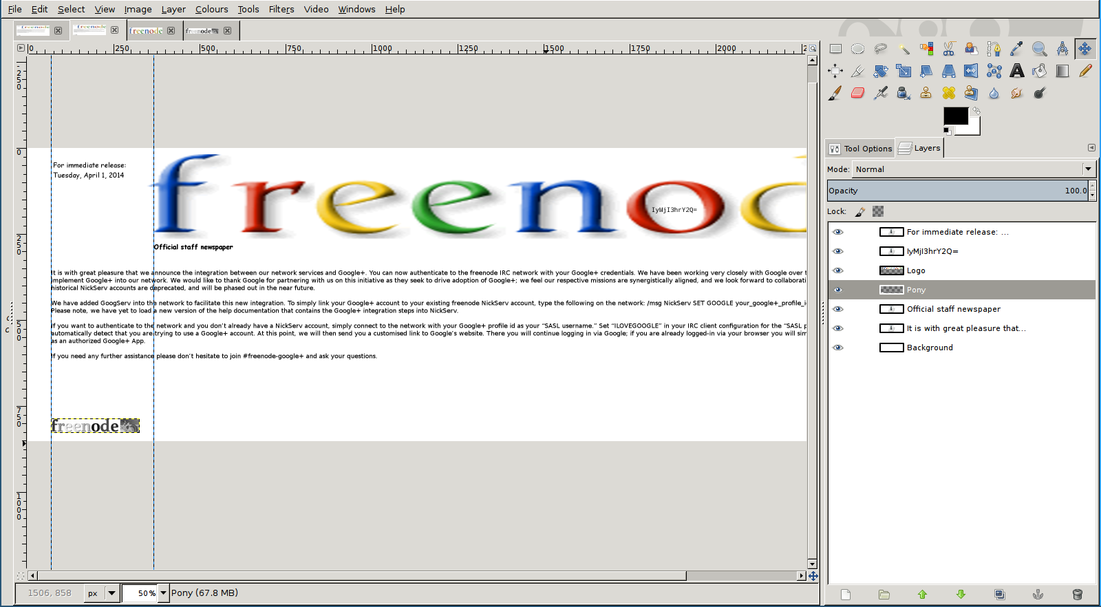
If the text is not in the right place, feel free to move the layer with the arrow keys. Hold shift for bigger movements. What you’re aiming for, is something like this.
Use the text tool again, but this time right under the freenode logo. Write ‘Official staff newspaper’ in size 19 bold Comic Sans MS Bold. You can drag a guide across to where the logo is to make sure you have placed your text in the right place. Once again, do feel free to move the text after you’ve created it, if needed.
Now for the last part, the pony image. We will steal this from our April 2012 blog post image, http://blog.freenode.net/wp-content/uploads/2012/04/ITucplOwnTShozIfVT1cM2u0VTWyVPZwp3EupaD.jpg. Simply bring in that image to GIMP and crop out the pony logo. Then, copy that image, and go back to your original. Make a new layer once again, paste the pony, and anchor the layer, like we did a while ago. You can also layer->autocrop layer if you want. Now, move the layer so that it touches the first guide, and leave some margin from the bottom, like so:
Congratulations, the hard work is done! Save your work, and export it as a png. (File->Export as…)
Now you may have noticed that the blog post image looks more like a scanned document. It’s ok, I’ll show you how to do this, too. It’s actually very easy, thanks to http://tex.stackexchange.com/questions/94523/simulate-a-scanned-paper.
Simply replace the command there to suit your filenames:
convert freenode.png \( +clone -blur 0x1 \) +swap -compose divide -composite -gamma 0.1 -linear-stretch 5%x0% -rotate 1.5 as-scanned.png
Note: the ‘convert’ command is part of the ‘imagemagick’ package.
And you should have your final result:
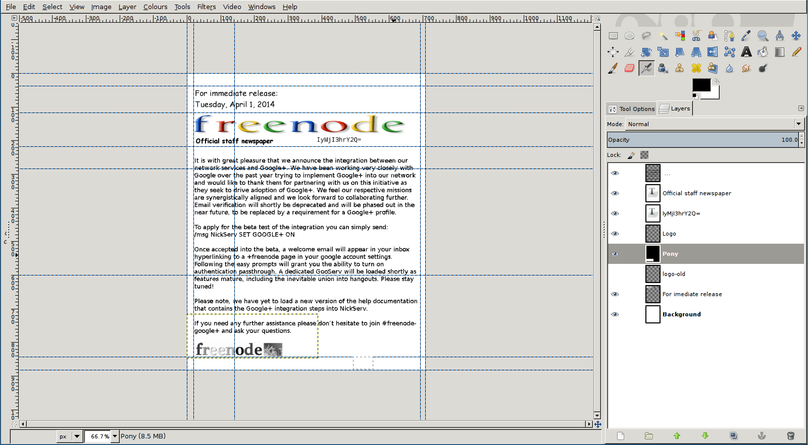
However, it seems that that image was too big for the blog.
Oh dear! But you can probably tell how I made the final image out of that: simply increase the canvas height as much as needed, and drag the text box to take over that area. Afterwards, use guides to move elements around as needed (you made layers, right!?). Because we need to resize the logo, I decided to move the hint, too.
You’ll easily get this:
That’s it, you’ve created an official page of the freenode staff newspaper, and made it look like it was scanned. Congratulations!
(Once again, this post, and of course the original one on blog.freenode.net is a bit of an April fool’s joke. My design skills aren’t normally THAT bad :D)